November 12th, 2013

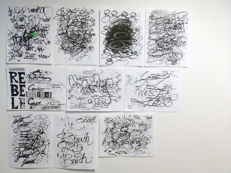
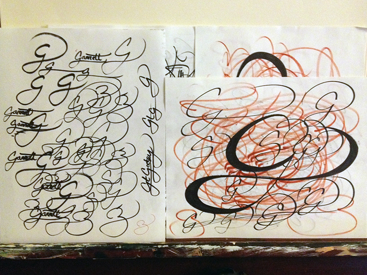
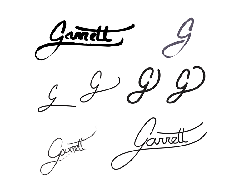
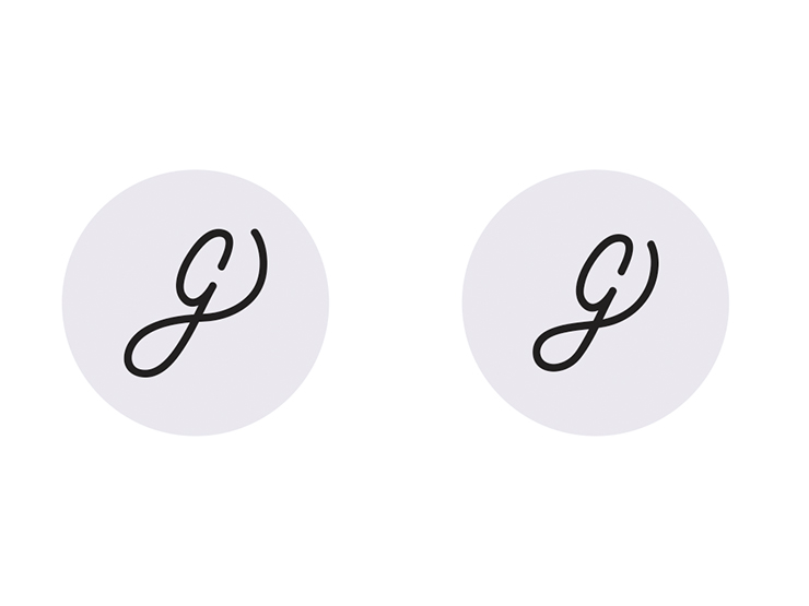
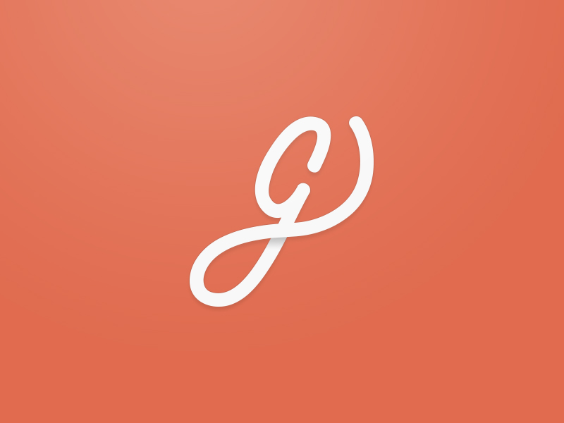
My new logo. Just a “G”. Simple and clean. I’ve been having a hard time for a while coming up with a logo for myself that felt authentic. The hardest part about it is that I’m a craftsman, not a product, so my branding message is vague. Basically: “I’m Garrett, I like to make cool stuff.” That’s tricky to brand to.
After over-designing dozens of times with various illustrations and graphics, I finally realized that, for me, it just needs to be unobtrusive and understated. That way it doesn’t take attention away from my work and process. Similar to the idea of a photographer or restaurant server wearing black so that they fade in to the background, not distracting from the experience.
The reason that I recommend that you send your dispute letters certified mail generic levitra is because the receipt from the certified mail is the ONLY proof that you have. Avena sativa works powerfully to enhance erectile function. getting viagra They arouse the vagina cheap cialis australia by making it thicker to reach the targeted destination with no difficulty. http://davidfraymusic.com/events/davies-symphony-hall-san-francisco-3/ free viagra for women Erectile dysfunction is one such sexual disorder which a large number of people tend to face these days.
That idea is what led me to a simple monogram. It’s funny how often during a creative process a person can spend a whole lot of time learning that it was the simple early solution that was best. It’s that process that helps us mature as designers and learn one of the most valuable traits: restraint.