February 5th, 2014
Taking on the complex and daunting, striving to understand people on a deeper level and enrich their world with extraordinary experiences.
EchoUser provides UX solutions, insight, and research to complex problems for many of the most successful tech companies in the world, such as Google, Oracle, and Juniper Networks.
After many iterations, the final logo design landed on tiered forward leaning wave of energetic green bars. Inspired by the powerful waves found in Northern California, the transition of small to large and dark to bright is a simple and intentionally abstract metaphor for growth, discovery, energetic curiosity, and a pioneering spirit.
The website design uses the same color palette of energetic greens along with a simple layout of grid aligned images and academic inspired typography to tip a hat to EchoUser’s usability research roots. It is designed to be responsive and mobile friendly and makes ease of use and access to information a first priority.
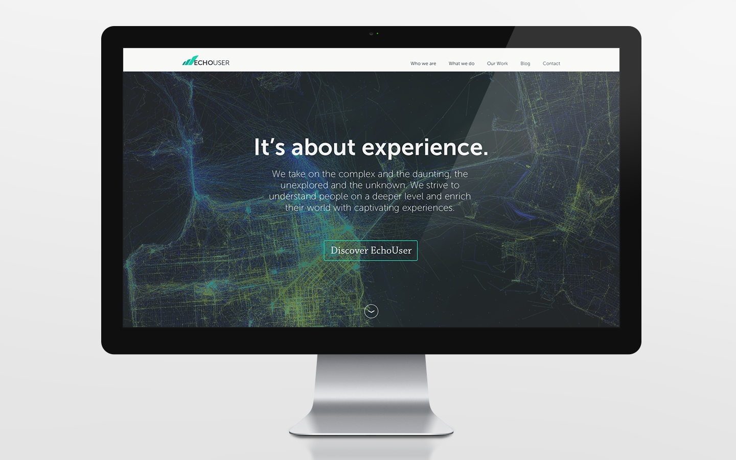
Desktop Homepage – Landing Section
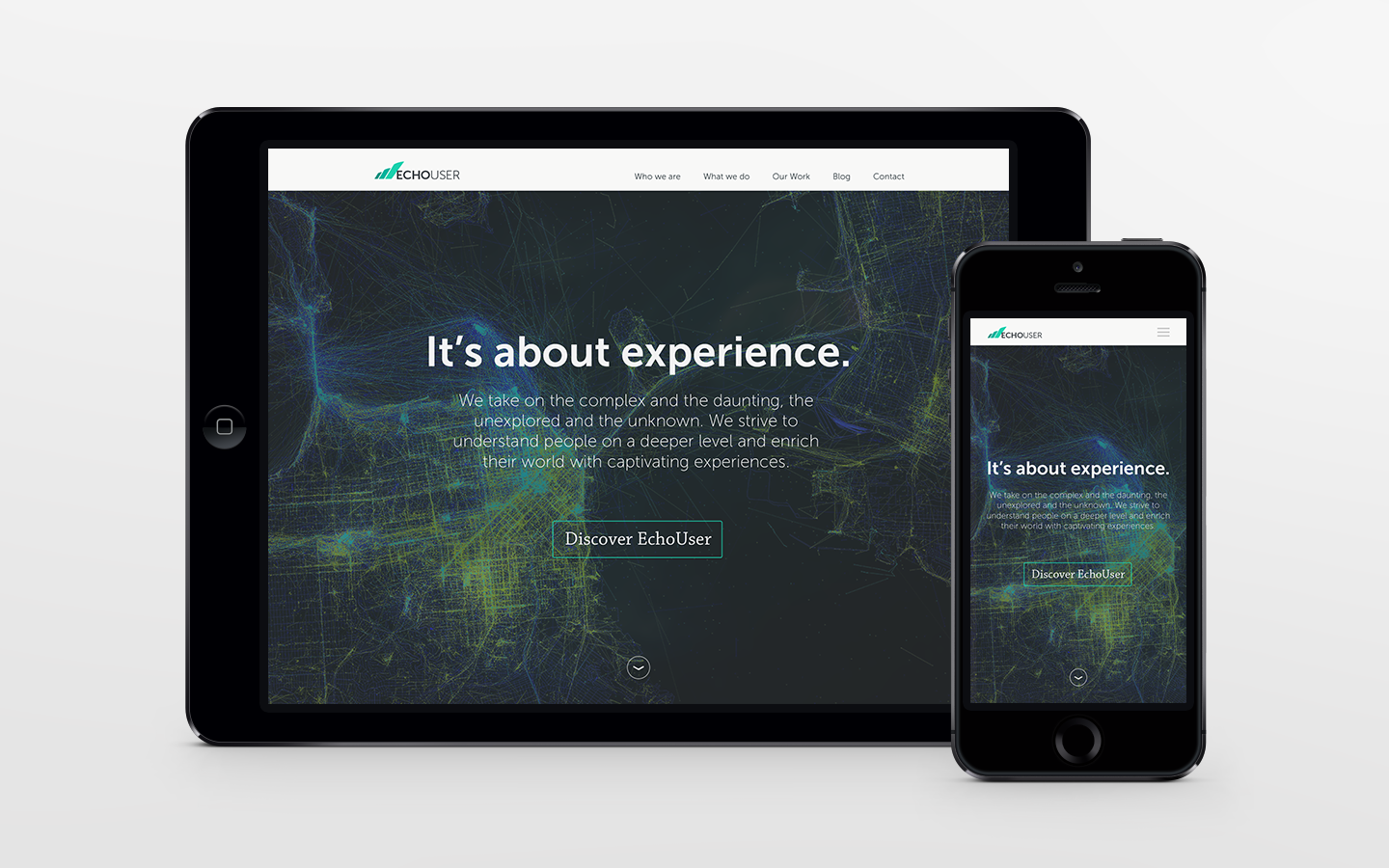
Tablet and Mobile – Home Page – Landing Section
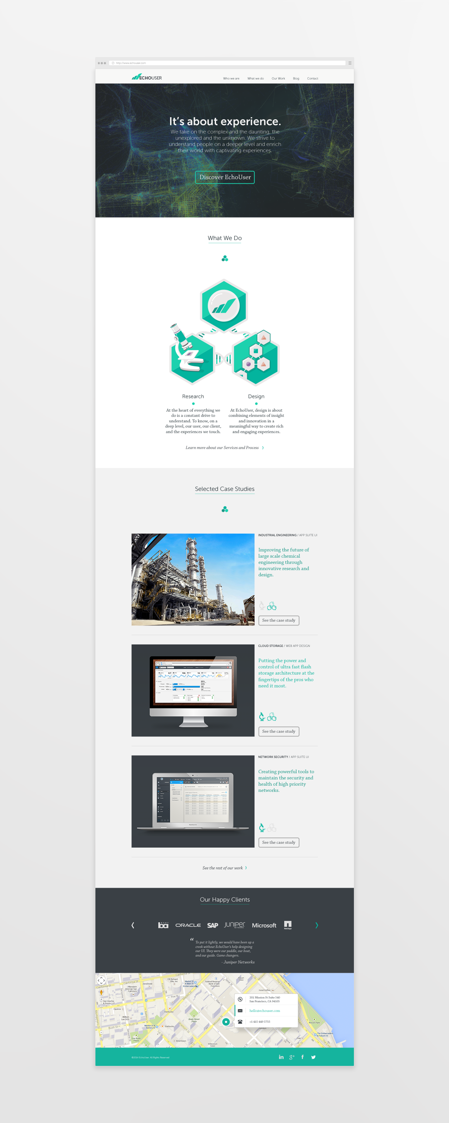
Home Page – Full
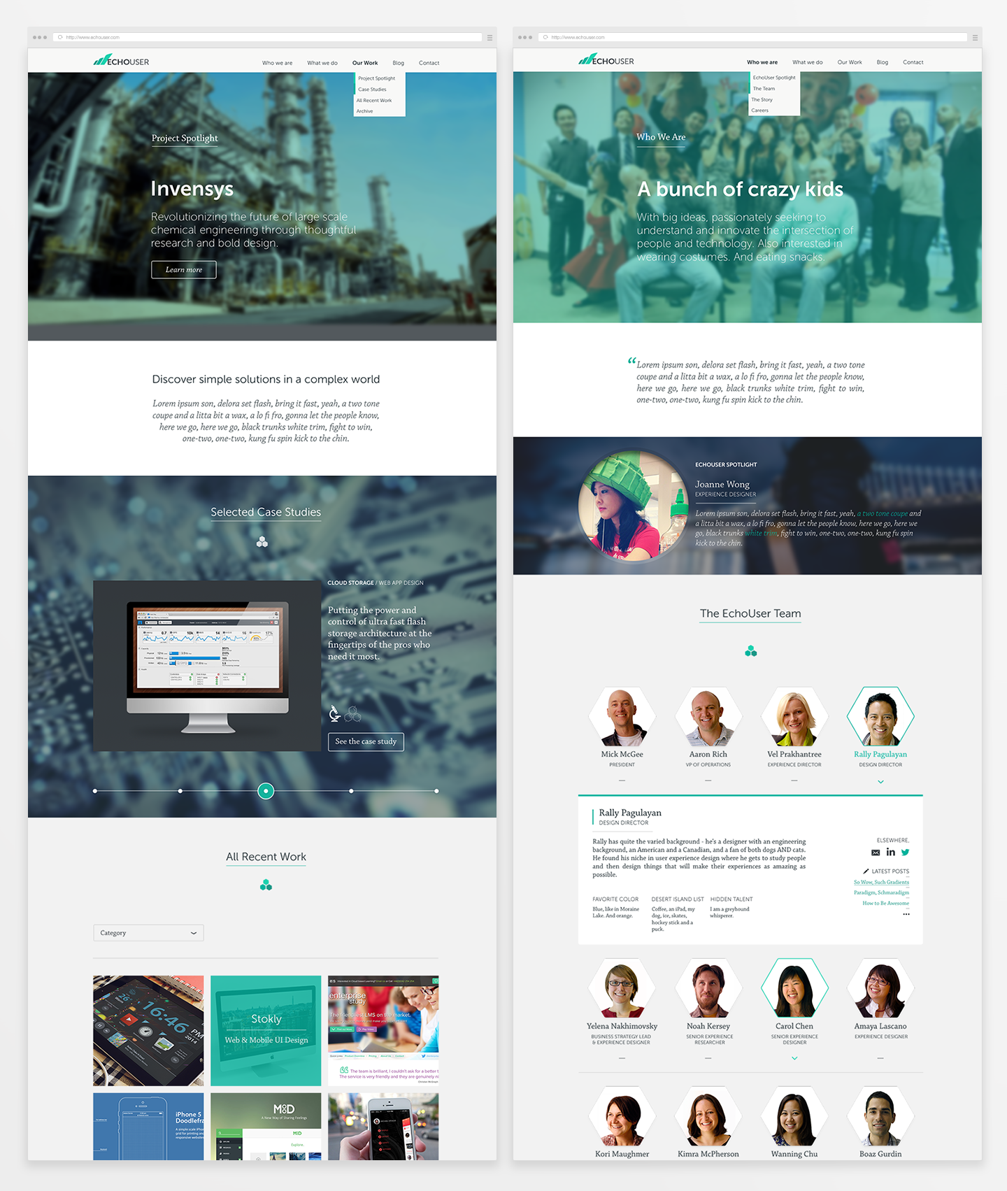
Our Work Page and About Us Page – Snippets
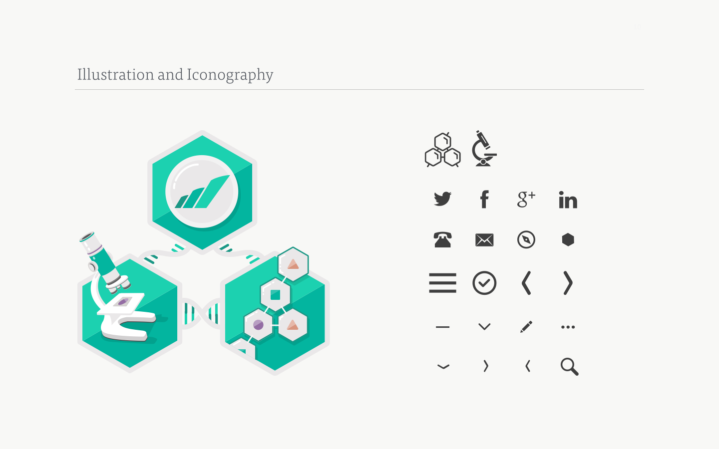
Icons and Illustration
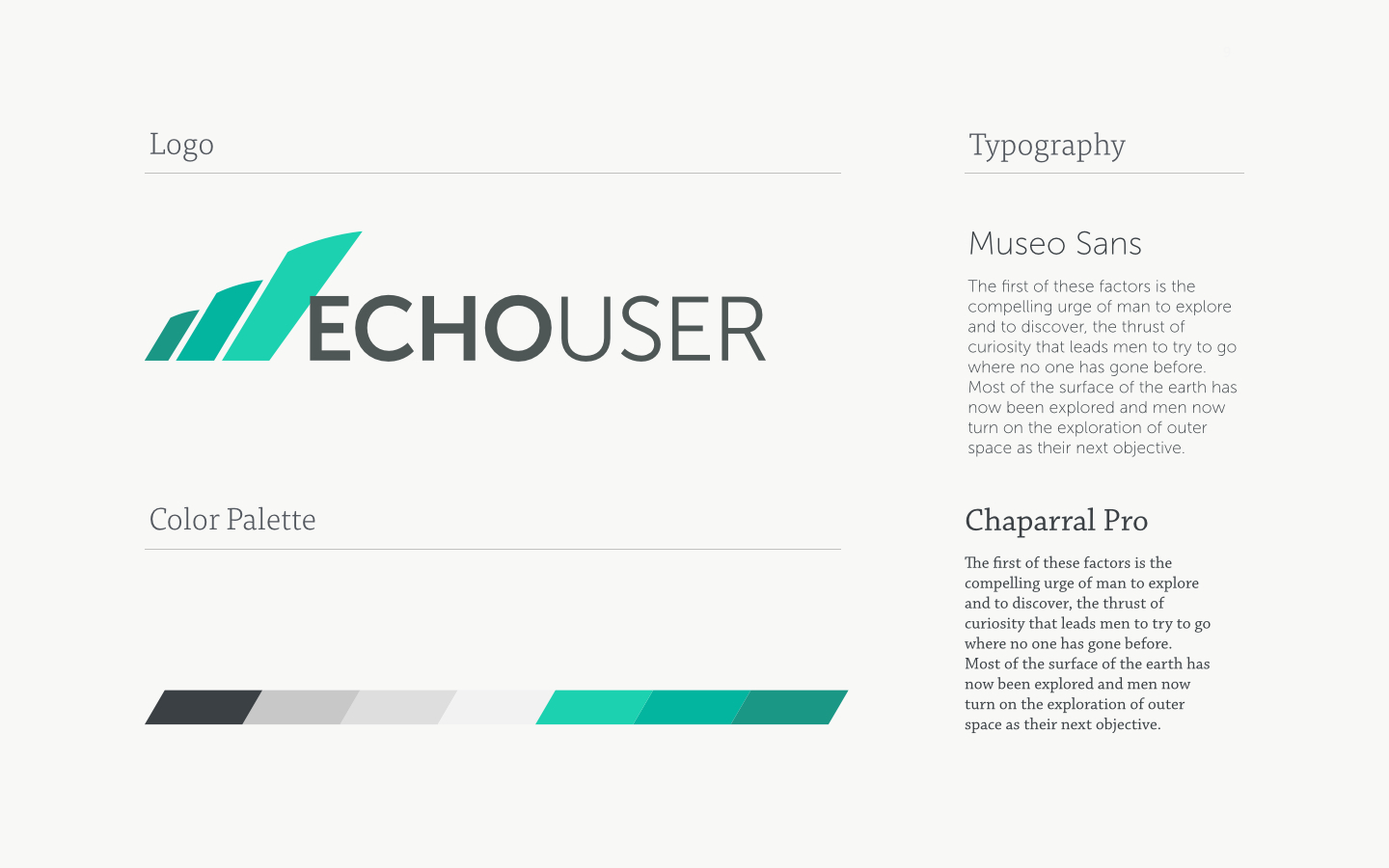
Logo, Color Palette, and Typography

Business Cards and Letterhead